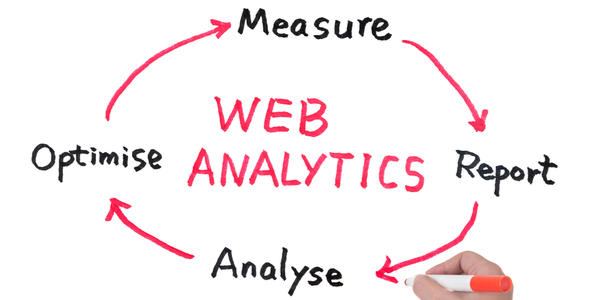
Data becomes useful information only when it is analyzed by some means. The first step towards data analysis is the proper representation of the collected data. Data visualization makes data appealing and easily intelligible to the viewer by representing the data in a graphical form. The importance of data visualization is underscored by the sheer volume of data that organizations must deal with daily. The easy availability of computers has simplified the task of data handling considerably. To consume the available data and make important decisions based on it, data visualization services come in handy for business organizations. These services can be used by businesses to transform the way data is presented, analyzed, and interpreted to derive maximum benefits.
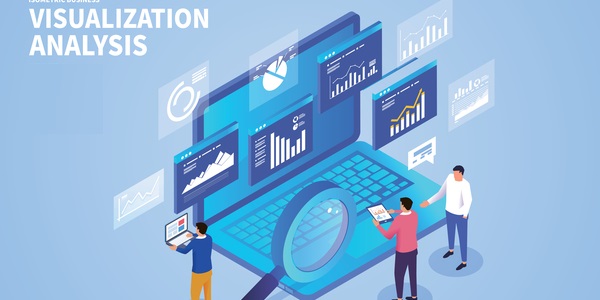
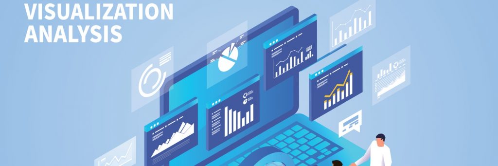
Data Visualization for Businesses
Businesses rely unequivocally on data generation and subsequent data interpretation. Only when data is translated into information does it become possible for business leaders to derive critical insights from it. The technological advances that have made data interpretation simpler are fueled by artificial intelligence, analytics, and other breakthroughs. Apart from interpretation, converting data into graphical forms is another step in aiding businesses to make sense of market trends. Past trends can be extrapolated to predict future opportunities, and this can be of significant benefit when scaling up of operations is required.
Considering that all businesses are now turning to data visualization techniques, it has become an imperative need to be incorporated into operations. Moreover, while keeping up with competitors and collaborators, businesses must speak the same language as them to remain relevant. Hence, good data visualization techniques have become vital for businesses.
Read Also What Is Data Visualization and Why Is It Important for Businesses?
The primary benefits that an organization derives from data visualization services include the following:
- Optimizing operations
The data presented to top management must be easy to interpret so that it does not take long to determine what the data is saying. A simplified data visualization system saves a significant amount of time by facilitating a smooth flow of operational activities. It is also possible for data visualization services to provide interactive dashboards that can make process monitoring and problem-solving much easier.
- Facilitating swift actions
Activities and responses can be fast-tracked when data is visualized dynamically. It becomes easier to program smart decisions in response to changes in data trends, thus aiding humans in decision-making. Having a software analyze and combat the different factors in a problem proves very helpful for humans to reach a decision that’s backed by logical reasoning.
- Correct data interpretation
Converting raw data into information requires an analytical mind. Even on the most productive of days, sifting through extensive business reports can cloud the conclusions drawn by a human mind. Thankfully, the use of data visualization tools makes it easy to remember critical business figures and messages conveyed.
- Future forecasting
Businesses thrive by accurately predicting current and upcoming trends in the market. A reliable data visualization services provider can help businesses to stay ahead of the game and make informed decisions based on facts rather than assumptions.
- Analyzing different scenarios
One of the best features of data visualization tools is the possibility of exploring different outcomes by adding weightage to different factors. A data visualization consulting services provider can help its clients to analyze different possible scenarios of the same market variables to make better decisions.
Common Types of Graphs Used for Data Visualization
Below is an overview of the most common types of data visualization graphs used by businesses. We also figure out the best use of each of these graphs in the context of business operations.
Scatter Plot
These are used to show the relationship between two variables. The dots in a scatter plot depict trends when the data is considered as a whole. From these trends, one can predict the value of the variable on the vertical axis, which is a dependent variable, for a certain value of the variable on the horizontal axis, an independent variable. The data in a scatter plot can be clubbed into groups depending upon how closely sets of points cluster together. Unexpected gaps in data can also get revealed.
Business use: To show the distribution of objects when there is paired data. It’s also used to identify correlational relationships between market variables.
Column Chart
A column chart, also known as vertical or bar chart, is a kind of data visualization form where each category of data is represented by a rectangle, the height of each rectangle being proportional to the value being plotted. Column charts have many variants, the most common ones used to depict multiple values of each category are Clustered Column Chart, Stacked Column Chart, and Pictograph Column Chart.
Business use: To compare products; for digital marketing, it can be used to check the revenue per landing page or even customers by the close date.
Bar Chart
The data is represented in the form of horizontal bars. The values are placed along the horizontal axis and the categories along the vertical axis.
Business use: When the value of any product category needs to be viewed intuitively; also to compare products or show sales in a given period.
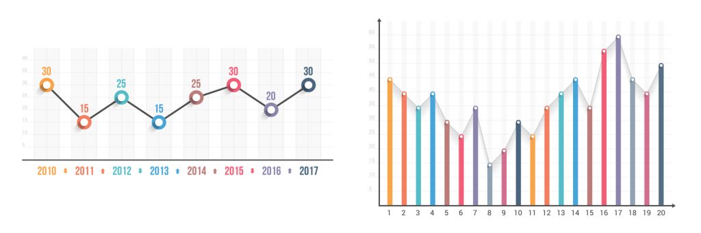
Line Chart
Data is represented in the form of points or markers joined by straight lines. This can be used to track changes over long or short periods of time. When smaller changes are involved, line graphs are better than bar graphs.
Business use: To track data changes over time; for example, show sales data by month.
Combination Chart
To emphasize the different types of information in a chart, different types of charts are sometimes combined. For example, a line chart showing price data may be combined with a column chart showing the volume of sales. This provides a flexible way of displaying data.
When to use: When there’s a large variation in data sets or if there are mixed data sets; for example, to show a large variance between forecasted sales and actual sales.
Pie Chart
A Pie Chart is a circular statistical graphic having slices that represent the numeric value of the data as a proportion of the whole data. The length of the arc and hence the angle it encompasses is proportional to the quantity it represents.
Business use: Show percentage or proportional data, compare areas of growth within a business such as turnover, profit, exposure, etc.
Area Chart
An area chart represents the change in one or more variables over time. Data is represented in the form of a line graph as a function of time. Area charts can be used to present the variation of single or multiple variables (stacked area chart in this case) over time.
When to use: To show market trends over time among related attributes.
Histogram
This is similar to a column chart except that there is no spacing between the columns. The entire range of data values is grouped into equidistant intervals. The number of data values in each interval is plotted. A histogram is used for representing continuous data. Histograms give an idea of where the values of a certain quantity are concentrated, the extremes, and whether there is any gap in the data.
Business use: To identify the most common process outcome, identify data symmetry, and spot areas that require extra effort.
Venn Diagram
A Venn diagram uses overlapping circles to depict similarities, differences, and relationships between ideas, concepts, or groups. Similarities are represented by overlapping circles or portions thereof, while differences are represented by non-overlapping circles. In the business context, Venn diagrams are used for market analysis, competitor analysis, product comparison, decision making, etc.
Business use: Compare and contrast products, services, and processes.
How to Choose a Graph for your Business?
Considering the multiple data visualization options available, it’s difficult for businesses to choose the right template for representing data. Therefore, businesses resort to data visualization solution providers to guide them to choose the best-fitting visualization form and make smarter decisions. Data visualization is like painting a picture with the available data rather than leaving it static on a table or spreadsheet. How good the picture turns out depends upon the choice of the tool for visualization.
When it comes to choosing which type of data visualization tools to use, here are some useful pointers:
1. For comparing values – If a direct comparison between two or more sets of data is intended, then bubble charts, spider charts, column visualizations, bar charts, or scatter plots should be chosen.
2. For understanding the composition – If the composition of the data needs to be demonstrated, one may choose among pie charts, waterfall charts, stacked charts, and map-based graphs.
3. For understanding the distribution of data – Charts that help one understand the outlier, normal tendencies, and the range of the information such as scatter plots should be opted for.
4. For analyzing trends in data – If trends are to be analyzed over a certain period, one may choose among the line chart, column chart, or area chart for effective representation.
5. For time-based data analysis– If the information to be conveyed is time-based or time-sensitive, dynamic line charts or bar graphs would suit.
As most modern corporates gear towards data visualization solutions to run their businesses, the market is flooded with data visualization consulting services, making it difficult to make a choice. For choosing the right data visualization service provider, the following key points must be considered.
- Relevant industry experience
It is desirable that the data visualization services provider has adequate experience of working in the same industry as the prospective client. Having a business partner that understands the infrastructure of the client’s industry is highly beneficial to the partnership.
- Data visualization arsenal
Another desirable factor is that the data visualization outsource services provider must be equipped with the latest technological tools so that the client may be provided the best service in the market.
- Understand the intent
The ideological intent behind the data must be well understood by the data visualization services company to make proper sense out of the data being generated. As different types of data require different analytical tools, the external partner must have a thorough understanding of the information it’s processing.
- Data Security
When outsourcing something as critical as operational data, it’s mandatory for the data visualization outsourcing services provider to have strict data security measures in place. Adhering to industrial security standards is an expected practice among service providers working with analytical data.
Why Outsource Data Visualization Services?
Having realized the need for data visualization, businesses must explore how best this can be implemented. An organization may resort to the services of a professional data visualization services company that aids its clients to transform raw data into readable forms. The advantages of opting for data visualization outsourcing services are manifold, and some of these are listed below.
- Access to specialized tools and processes
Professional data visualization service companies carry the latest tools for collecting, analyzing, and presenting data. Their ability to use the right tools to analyze huge volumes of data comes with their significant industry experience and reliable process workflows.
- Reduced overhead
Since data visualization requires the expertise of software engineers, data analysts, and database specialists, it’s a much better option for businesses to avail of the services offered by a reliable data visualization service provider at a significantly low cost.
- Support for the core team
When businesses decide to outsource data visualization services, they provide the core management team with the information necessary for improved operations management. The core members are thus freed from the hassles of involving in the intensive data visualization processes.
- A second perspective
When businesses become swamped by daily operations and cannot spare enough time to analyze the data being generated, the insights offered by data visualization outsourcing service providers can often save the day. The fresh perspective offered by the external services provider can make the same data appear more meaningful.
Who We Are And Why We Are Considered an Industry Authority?
At getSmartcoders, we provide clients with the perfect understanding of data to create easy-to-grasp visual representations. We use our vast experience and the latest digital tools to serve our clients with the best models for their data. We also customize our analytical tools to meet the unique and challenging needs of businesses. Combining our skills with advancing technologies allows us to put forth the very best of services in delivering data visualization solutions.
 Prev
Prev