
Starting April 21, Google will unleash a new algorithm to determine search engine rankings. Web masters are busy trying to figure out the possible impact of its upcoming update, especially when Google has made it known that the impact is going to be significant. The question topmost in everyone’s mind is how much of an impact will the new algorithm actually have. Will it surpass the impact of Panda or Penguin? In all possibility it will.
The new algorithm comes at a time when mobile has become the dominant channel in search marketing. A look at Google’s traffic in 2014 reveals it all. From June to November, mobile traffic made up nearly half of Google’s total traffic. In November, the tables were turned. Mobile traffic surpassed the traffic from desktop, thus ushering in the era of mobile dominance for Google.
This trend is well in line with a 2014 annual mobile search advertising report, which said that by December 2015, 50 percent of all paid search clicks on Google will be carried out on mobile devices. Google had foreseen this trend way back in 2013, during the Hummingbird update, and so had made it clear that the future of search is mobile, and websites that fail to adapt will suffer.
Coming back to the impact, one thing that stands clear is that pages not optimized for the mobile will drop from mobile rankings. Desktop rankings might also take a hit because Google’s ultimate objective is to ensure everyone embraces mobile. It’s precisely because of this reason that the mobile algorithm will analyze a site page-by-page for mobile friendliness. This means sites which have optimized only some of their pages for the mobile won’t be able to compete on an equal footing with sites which have all their pages optimized for the mobile. In other words, responsive and well-designed sites may not have to face the music at all. Further, Google has made it known that it would surface content from indexed apps more prominently in search. This means sites having an Android app just for the sake of it might i.e. without any deep links on site may take a hit.
Mobile Friendly Checklist
Here’s a list of features which Google might be looking for in its new algorithm.
Website Content Should be as wide as the Screen:
If your users don’t have to scroll side-to-side to read the page of your website, it means you have made things a lot easier for them. This would count in your favor.
Text is Readable
In trying to attempt the above, you should make sure that the text doesn’t get too small to read. If you use a font size which is legible on all screen size, it means user need not zoom to read text on the page. This would score for you.
Links are Afar
If users can tap links with their fingers the right way i.e. without tapping open the adjacent link, then your site is mobile friendly. Google would interpret this as a mobile friendly layout.
Image Width
If you give your images a maximum width of 100% so that they are automatically resized if they get too big for the mobile device, then you have made the mobile experience great for your users.
Fixed Positioning
If you disable the fixed position when your website is viewed on a mobile device, your header won’t zoom and obscure the whole screen. This will curry favor with Google.
Mobile Viewport
The mobile viewport controls the width of the page for the device. It’s important to set the viewport for mobile for every page. If you site is built on a responsive web design, then it will adjust the viewport based on the device automatically.
Deep Link Apps
If your site has an Android app associated with it, get it deep linked and indexed right away.
If you have taken care of these, you are on the right side of Google’s new requirements and may not have much to worry about.
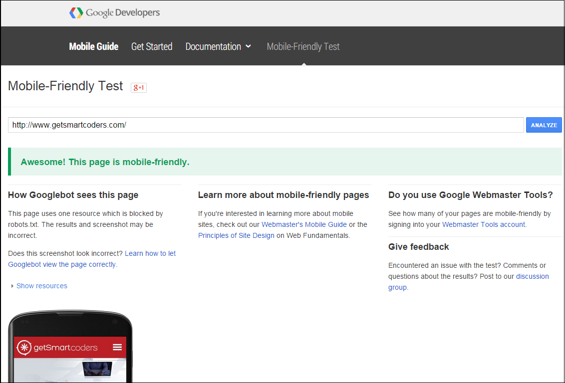
To find out whether your website is mobile friendly, analyze you website through Google’s mobile-friendly test page.
What to do?
However, if you are still not sure of whether your site would pass the new test, you can use Google’s site analyzer to see where you stand. The test can help you resolve a host of issues and errors, some of which include:
• Slow page loading
• Technical issues with the content display
• 404 error for mobile screens
• Redirecting malfunctioning
• Wrong cross links
While you undertake the above test, it is equally important to undertake a speed test to determine the following:
• Issues with hosting
• Page load time
• Flash elements and images on website
• Blocked scripts on webpages
If you want to survive the new mobile shake up, you need to get all these done before April 21. However, this is easier said than done because transitioning to a responsive design can be a significant undertaking. Only companies which have managed countless mobile transitions have the expertise to deliver the right time-bound solution for your business. If you are looking for a quick and seamless transition to the mobile, get a responsive web design quote from us.
 Prev
Prev

